
After a thorough analysis of our clients' needs and in an effort to enhance the quality and efficiency of employee satisfaction and engagement research, we have upgraded our graphs to enable even stronger analytics. These graphs provide more detailed and higher-quality data filtering and visualization, a fresh user interface, and intuitive features that will provide added value and are tailored to our clients’ specific requirements.
Improved visual design
With our latest update, we have revamped the visual design of our graphs, making them more visually appealing and easier to interpret. The new visuals are thoughtfully crafted to present complex data in a clear and engaging manner, ensuring that users can quickly grasp the key information at a glance. By leveraging intuitive color schemes, streamlined layouts, and eye-catching charts, we aim to enhance the overall user experience and facilitate data-driven decision-making.
User-friendly and intuitive interface
In addition to the visual upgrades, we have also enhanced the user interface to be even more user-friendly and intuitive. We understand that ease of use is paramount when it comes to navigating through data and generating valuable insights.
Clients will find it easier than ever to access and analyze their employee engagement and satisfaction metrics.
Amplified reporting features
Building on the importance of our existing open question-based metrics, we have expanded our tool’s capabilities to include the feature of adding additional comments to all questions. This empowers users to provide more context, capture qualitative feedback, and gain deeper insights into the results.
As Luppa continues to stand out with its exceptional benchmarking system, in addition to our enriched reporting features, clients now have the capability to compare their data with industry and market benchmarks. This innovative functionality, available to clients who have it included within their packages, empowers organizations to assess their performance with precision and identify areas for improvement more effectively.
Clients can now gain valuable context by aligning their data against industry and market standards, enabling them to understand their position and progress within their respective markets. This comparative analysis offers a clear advantage, facilitating more informed decision-making and strategic actions to propel organizations towards success.
Additionally, clients can now utilize ‘internal benchmarking’ feature to compare individual teams results with the overall company results, further enhancing their ability to gain insights and drive improvements at a granular level.
Incorporating colors and functionality: Words from our Head of Design Strahinja Marković
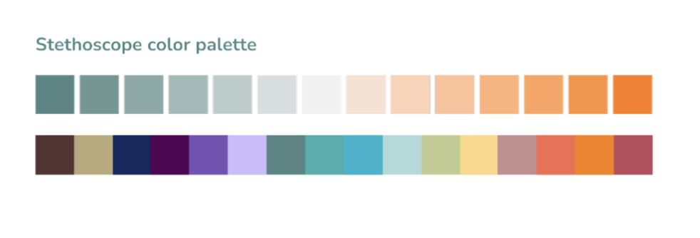
The color palette of Luppa is carefully crafted to evoke a sense of visual appeal and brand identity. It comprises darker shades of green, which are prominently used in printing, along with vivid orange and vivid blue, which are elegantly featured in our logo symbol. With a focus on information, which is abundant within our product, and frequent usage by HR professionals, employing vivid and vibrant colors would burden users with constant visual stimulation. Therefore, I introduced a palette of softer pastel hues derived from darker shades of green and orange, accompanied by a subtle gray tone to create a smooth transition between the two primary colors. This color scheme serves as the main palette for displaying graphs.

When dealing with complex graphs that present various data points requiring distinct colors, I utilized a range of softer pastel tones to ensure visual harmony and consistency in communication.One of the most challenging graphs to design was the Dimensions graph due to its abundance of information. To highlight the columns that are compared to the market and industry, a line pattern was used. This pattern is convenient as it partially reveals underlying data, allowing for easy comparison with the industry and market benchmarks.

Similarly, Custom graph posed a significant design challenge. Displaying dimensions and ratings for each segment, which were numerous, required comparison with industry and market data. To facilitate this comparison, a line pattern was incorporated. Furthermore, to emphasize differences in ratings for each segment, I added a zoom-in and zoom-out feature to the graph. Design encompasses not only colors, spacing, and patterns but also functionality.
Luppa is committed to an unwavering pursuit of delivering even more valuable data and driving innovation in the realm of employee engagement and satisfaction. We will continue to push boundaries and refine our tool to provide organizations with the most comprehensive and actionable insights. With a focus on continuous improvement, we strive to empower businesses to cultivate thriving workplaces and unlock their full potential. By carefully considering the colors and functionality of our graphs, we aim to provide a visually pleasing and intuitive experience for our users, allowing for clear data interpretation and analysis.
Continue reading our blogs to learn more about employee engagement and concrete tools that will help you with employee retention.